

Well, now, let’s talk about these NBA club logos. You see, every team in the NBA, they got their own little symbol, and each one of them tells a story. Some are mighty fancy, others, well, let’s just say they ain’t much to look at. But, there’s no denying that those logos are as important to the game as the players themselves. They represent the heart and soul of each team, and they’ve been through a lot of changes over the years.

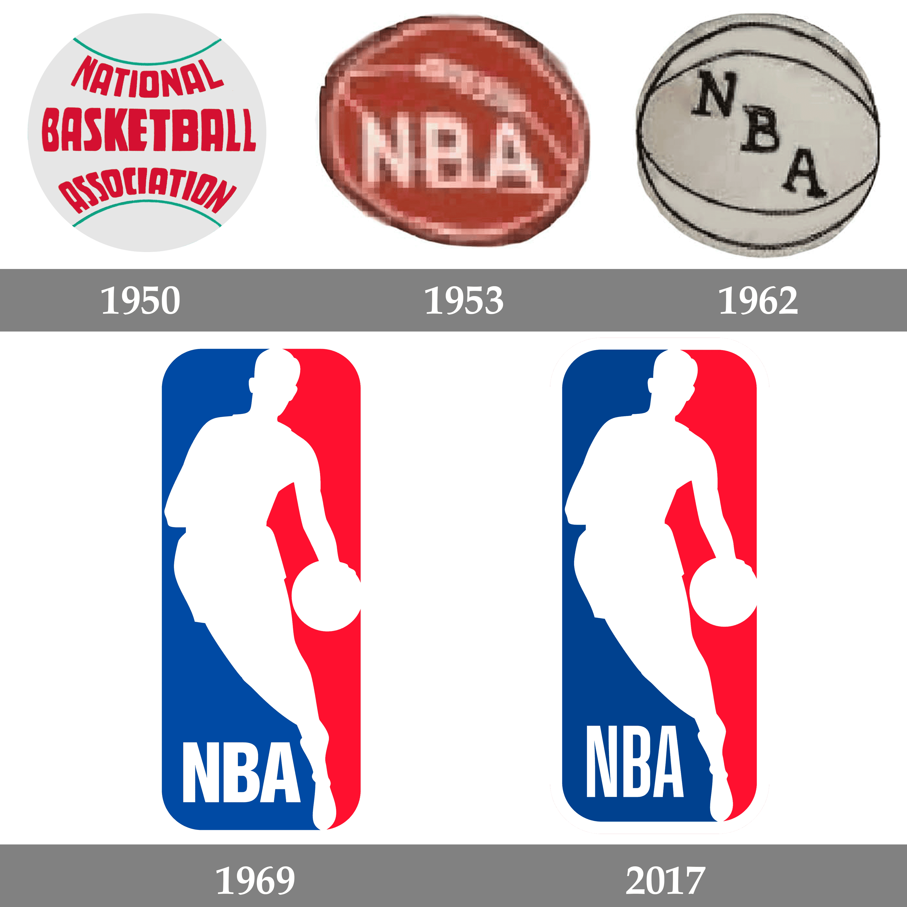
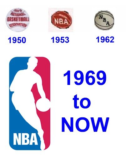
Now, you probably know the most famous one, the NBA logo itself. It’s that silhouette of a fella dribblin’ a basketball, and folks say it’s based on Jerry West, the old Lakers star. That’s right, in 1969, the NBA decided it needed a new look, something to represent the whole league, and they picked Jerry West’s image for the job. Ain’t that something? But you might not know that the NBA’s logo ain’t the only one that’s got a bit of history behind it. Every team’s logo has a story, even if it’s not as well known.
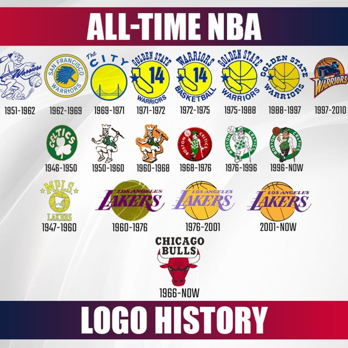
Take the Los Angeles Lakers, for example. Their logo has gone through a couple of changes, but it’s always been tied to the city of angels and the glamour of Hollywood. The Lakers’ logo went from just a basketball with “Lakers” written on it to the current one, which shows a basketball with gold trim and a swish of purple. It’s all about showin’ off that star power.
Then there’s the Chicago Bulls logo. That one’s pretty iconic, too, don’t ya think? A big ol’ angry bull right in the middle. It’s as tough as the city it represents. That logo’s been around since 1966, and it’s stayed mostly the same, because, well, when something’s good, you don’t mess with it. The bull’s a symbol of strength, power, and determination, just like the team itself.
But, let’s not forget about the Boston Celtics, another team with a long history and a logo that’s just as storied. Their logo features a leprechaun, a cheeky little fella with a big ol’ smile. This logo ties back to the team’s Irish roots, and the leprechaun’s always been a symbol of good luck. It’s been part of the Celtics’ charm for decades, reminding folks that no matter how tough things get, a little luck can always help you along the way.
Now, not all NBA logos are as simple and clean as these big-name teams. Take the Memphis Grizzlies for instance. Their logo’s a bit newer, but it’s got its own style. It shows a big ol’ grizzly bear, and it’s meant to represent the fierce spirit of the team. When Memphis joined the NBA in 1995, they wanted to make sure their logo stood out and captured the grit of their city. And they sure did. Ain’t nobody forgettin’ that big ol’ bear.
Of course, there’s a lot of newer teams with their own logos too. The Miami Heat, for example, their logo’s got that flame comin’ outta the basketball. It’s all about the heat, the fire, the passion, and the intensity that the team plays with. Then, you got teams like the Denver Nuggets with their mountain theme, which just screams Colorado.
But, you know, not every NBA logo is a winner. Some of them have, well, let’s just say, missed the mark a few times. I remember when the Toronto Raptors had that weird purple dinosaur. Now, I don’t know who thought that was a good idea, but it sure didn’t stick around for long. Nowadays, they’ve got a cleaner, more modern logo with a sleek-looking basketball.
Speaking of changes, it’s worth mentionin’ that NBA logos don’t just stay the same forever. They’ve been tweaked and updated over the years to keep up with the times. Some teams, like the New York Knicks, have kept their logo pretty much the same, but others have made a lot of adjustments to modernize and appeal to new generations of fans. The Brooklyn Nets, for instance, completely changed their logo when they moved to Brooklyn. Gone was the old Jersey look, and in came a sleek, minimalistic black-and-white design that really represents the hip vibe of Brooklyn.
But here’s the thing: a logo ain’t just about lookin’ good. It’s about representin’ a team’s identity. It tells you what the team’s all about, even before you see ‘em play. A good logo captures the spirit of the team, the city, and the fans. And over the years, NBA logos have evolved just like the game itself, with every change reflectin’ a shift in the culture of basketball.
So, whether you’re a die-hard fan or just a casual watcher, those logos are there, tellin’ you a story every time you see ‘em. From the NBA’s iconic silhouette to the bulls, leprechauns, and bears of the teams, they’re all symbols of pride, tradition, and the love of the game. And, if you ask me, that’s what makes ’em so special.
In Conclusion: NBA logos are more than just pictures on jerseys or on the court. They represent decades of history, the pride of the teams, and the passion of the fans. From Jerry West’s silhouette to the colorful and creative logos of the teams, each one tells a story that’s as deep as the game itself. So next time you see one of those logos, take a second to think about the history and the meaning behind it. You might just see it in a whole new light.
Tags:[NBA logo, NBA team logos, basketball logo design, NBA branding, Jerry West logo, NBA history, NBA teams]


