

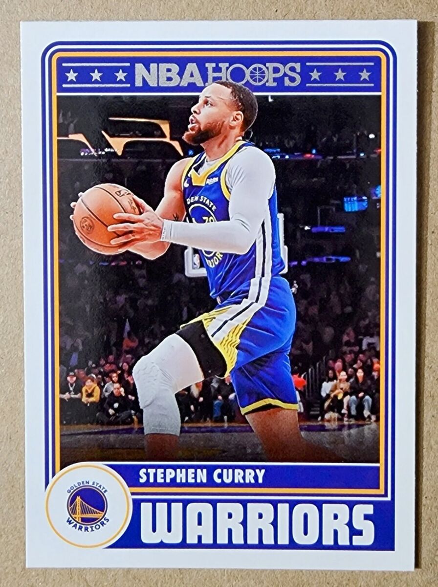
So, I’d been kicking around the idea of making my own Steph Curry NBA card for a bit. Not to sell or anything crazy, just a little something for myself, you know? I’m a big fan, obviously, and I’d seen some really neat custom ones floating around online. Figured, why not give it a whirl? It’s one of those things you see and think, “Yeah, I could probably knock something like that out.”

Getting Started – The Scavenger Hunt
First order of business was tracking down a solid picture of Steph. You’d think that’d be a piece of cake, right? Wrong. Man, I must have burned a good hour just sifting through images. So many are just too small, or they’ve got some ugly watermark plastered all over them. Eventually, I landed on a pretty decent action shot, him in that classic shooting form. Had to make sure it was good enough resolution, otherwise it’d end up looking like a blurry mess on the actual card design.
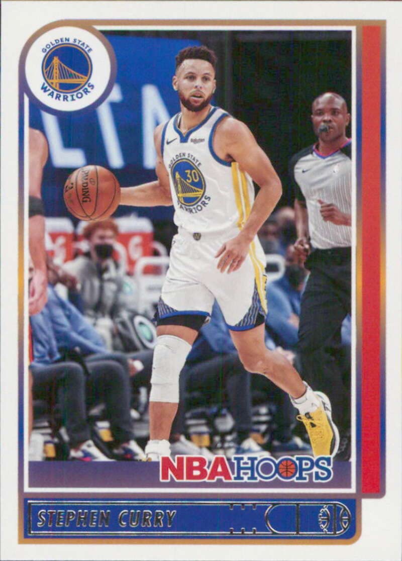
Then I started thinking about the actual card design. Didn’t want to just, like, paste a photo onto a white square. That’s boring. So, I pulled up a bunch of different NBA cards, old school ones and the newer stuff, just to get a feel for what’s out there. Some are super over-the-top flashy, others are more chill and classic. I decided I wanted something clean, but still with a bit of pop, a bit of energy.
Putting It All Together – The Nitty-Gritty
Alright, so I booted up my usual graphics program. You know the one, the big photo editing software everyone and their dog uses. Gets the job done. I started by setting up the canvas to the right dimensions. Just standard trading card size, nothing weird there.
Getting Curry onto the card was next. I had to cut him out from the background of that photo I found. That took some serious patience, man, especially around his hair and the basketball net. Those little fiddly bits are always a pain. My hand was definitely starting to feel it by the time I was done with that part, not gonna lie.
After that, I worked on the background for the card itself. I messed around with some Warriors colors, you know, the blue and gold. Tried a gradient, then just a solid block of color, then some weird abstract shapes. Finally landed on this kind of dynamic swooshy thing behind him. Took a few attempts to get it looking cool and not just, well, lame.
Text was a whole different beast. Picking out fonts always ties me up in knots. I wanted something that looked modern but was still easy to read. One font for his name, a different one for the team, and then a really small one for some basic stats – like points per game, assists, that kind of thing. I didn’t want to just cram a bunch of numbers on there. Sometimes, less is more, you know?
- I put his name nice and big at the bottom, pretty bold.
- Tucked the Warriors team logo into one of the corners.
- Added a little bit of text for his position, “Guard.”
- Then I threw on a simple border, just a thin line to kind of frame everything up.
I just kept fiddling with it. Shifting things around by a tiny bit here, a tiny bit there. Is that centered right? Is that text too big, or too small? You know how it goes. You stare at the thing for so long, you start to doubt every single decision you’ve made.
The Final Product and Some Random Thoughts
After what felt like forever, I finally got it to a place where I was feeling pretty good about it. Saved the file, obviously. Probably made a couple of different versions with tiny little changes, just in case.
Looking at it now, it’s not half bad for a homemade job! I think it’s got that Curry feel to it. It’s not like, professional grade or anything, I didn’t go get it printed on fancy card stock or mess with holograms. But as a digital thing, just a little personal project, it was a decent way to kill an afternoon. Plus, now I’ve got my own unique Steph Curry card. Kinda neat.
The whole shebang, from digging up that first image to the very last little tweak, probably ate up a good few hours. More than I thought it would, to be honest. But that’s usually how these creative side quests go, right? You get sucked into the zone. Definitely picked up a few more tricks for messing with layers and text effects in that software. Every little project adds to the toolbox, I guess. It’s all practice.


