

Alright, let’s talk about the WWE Survivor Series logo. I’ve been watching wrestling for what feels like forever, and these little details, like the logos, always catch my eye. It’s not like I’m a graphic designer or anything, but you see something enough times, you start to notice things.

My Journey with the Survivor Series Branding
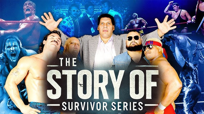
So, Survivor Series, right? It’s always been one of the big ones. You know, alongside WrestleMania, Royal Rumble, and SummerSlam. They call ’em the “Big Four” for a reason. Because of that, I always felt its logo should have some punch, some real identity, you know?
And boy, has it changed over the years. I kinda made it a little game for myself, to see how it would morph each November. It’s like a visual history lesson in a way. I remember way back, when it was still the WWF. The vibe of those early logos was just different. More raw, maybe? Simpler, definitely. Then the whole parent company name changed, Titan Sports became World Wrestling Federation Entertainment, Inc. around ’99, and slowly, things started to shift visually too.
I actually spent some time looking back at a bunch of them. Not like, super intense research, just pulling them up online and comparing. What I found was interesting:
- Some early ones were very, very basic. Just the words, maybe a slightly stylized font.
- Then you hit the Attitude Era, late 90s, early 2000s. The logos got a bit grittier, more industrial looking sometimes. That matched the whole vibe of the shows back then.
- After the WWF became WWE – remember that whole thing with the World Wildlife Fund? – the logos started to feel a bit more polished. Cleaner lines, more modern.
My process was pretty straightforward. I’d just look at them one after another. Sometimes I’d try to guess the year just by the style. It’s funny how a logo can transport you back. I’d see one and think, “Oh yeah, that was the year of that match!”
Honestly, some years, the logo felt a bit… well, bland. Like they just picked a cool font and called it a day. Other years, they really tried to capture that “survival” theme, maybe with imagery that suggested teams clashing or a battle for supremacy. I always preferred when they leaned into the event’s unique concept. It just made more sense.
I even noticed how the overall WWE branding evolution influenced it. When the main WWE logo got its big redesigns, you could often see a ripple effect in the pay-per-view logos, Survivor Series included. They’d adopt similar design philosophies, maybe the same kind of gloss or sharpness.
So yeah, that’s been my little ongoing observation. Just watching how this one piece of branding has twisted and turned. It’s not like I’m keeping a spreadsheet or anything, just mental notes. But it’s a cool way to see how the company’s presentation has changed over decades. Each logo is like a little time capsule for that specific event. Pretty neat when you think about it.


